Other Blogs: Terrorism Freebie
Gawker posted this today that cracks me up:
I would totally buy this for my kids if I had any.....I wonder if you could get this stuff in the 50s about Russia and the Soviet Bloc
Gawker posted this today that cracks me up:
I would totally buy this for my kids if I had any.....I wonder if you could get this stuff in the 50s about Russia and the Soviet Bloc
If you didn't already know, I have a scholarly interest in city magazines. Fair warning that if any conversation veers into the realm of "Gee, I really enjoyed reading X city magazine when I lived in X city" you will probably get a long and detailed response back about that magazine's success, circulation rate, and possibly even a critique on their design and how cool their art director is (from my personal experience, city magazine designers pretty much kiss ass).
There's a big debate (in my head) between city magazines and their evil twin, luxury titles. While city magazines theoretically delve into investigative features at least once a year on problems facing an area, luxury magazines tend to focus more on specific area or zip codes. Content in luxury titles will remain strictly fluff, usually because these magazines are focusing all their attention on nabbing the Nordstrom and Porche advertising market. Circulations are met by sending the magazine free to specific neighborhoods--and these magazines can easily become thinly veiled marketing tools for advertisers to reach their specific audience.
The question that has been on the minds of magazine folk lately (okay, it's prol just me and people like Samir Husni worrying about this stuff) is whether or not luxury titles will thrive or fail with the coming recession.
The scholarly rule of thumb (i love sounding all expert) is that city magazines are by definition, 'luxury' expenses that are usually the first thing to be cut when a reader starts budgeting. The genre continually goes through periods of growth (the last ten years) and decline (the 90s). Lately cities have been flooded with the luxury titles, creating an illusion of competition even though readerships and advertisers are usually entirely different. You would assume, though, that once this recession hits, these titles will close up shop because no one is buying diamonds and fancy cars....but what's even more depressing than a bear market in the magazine industry is that financial worries will have absolutely no effect on luxury titles:For those that are accepted as leaders in whatever luxury category they happen to be pimping, they should be able to ride out the wave just fine, because a rich person losing money can still afford a magazine, while a poor person can't. [Gawker]
It doesn't help matters that more traditional city titles are closing up shop, either. Good thing I didn't apply for that job there like I was thinking to.....
Posted by
Unknown
at
9:17 AM
![]()
Labels: City/Regional News, Magazines
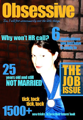
That comes out of a story on why magazines feel the need to count up to insanely high numbers on the cover that no reader would ever actually double check. I found it via UnBeige.And what poor sap has to total everything up?
“We’ll assign a research assistant or a hapless intern to try to count up most of the tips in the magazine and find some way to quantify for the cover of the magazine,” Mr. Zinczenko said.

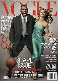
You've got to love a good controversy to hype up PR for a magazine. Jezabel has an update/recap of the LeBron James Vogue cover here.
Samir Husni was quote in a USA Today article:
Husni believes the photo was deliberately provocative, adding that it "screams King Kong." Considering Vogue's influential history, he said, covers are not something that the magazine does in a rush.
"So when you have a cover that reminds people of King Kong and brings those stereotypes to the front, black man wanting white woman, it's not innocent," he said.
 ....hmmmm....this image actually brings to mind the ever present financial woes of the country right now. LeBron's anguish suddenly seems real as he learned the value of his BearSterns stock .....WAY too politically ironic for Vogue, though.

Defamer has a pretty spot-on analysis of the extent of Photoshopping done on Ryan Seacrest for the April issue of Details:
They found 6......and you get bonus points if you can spot the final two before peaking at the answers.

So Vogue's new cover features Giselle and LeBron James on the cover. This is the first appearance of a black man on the cover of Vogue which of course means it's more controversial than honorary.
Groups are saying depicting LeBron in this 'King Kong' pose plays on old stereotypes, and a less controversial cover image was available.
What do you think? I would argue that you can't just put an athlete on the cover and treat him like any other male model, as it looks in the 'alternative' but I also think they could have dressed him up a bit more---given him a David Beckham treatment with maybe a designer suit? GQ and Details do that all the time...
I'll have to think about this more, but as of right now, I'd say it's not bad enough for the uproar, but not nearly good enough to be tried again.

Favorite new blog: Photoshop Disasters finds the little things that make Photoshopped images SO FUNNY
Gawker has the best of the best here
Posted by
Unknown
at
8:47 AM
![]()

 I am having a really hard time with Christian winning Project Runway--but considering I've hated most of this season, I suppose it's just on par for the course that I hate who they chose as the winner. I feel this is the natural conclusion to a debate that has been raging since Chloe won Season 2 over Santino. Is this show entertainment, or is it actually trying to foster creativity among up and coming designers?
At the heart of the matter is the definition of what fashion should be. I firmly believe women's fashion can be split into two categories: Wearable and Wonderful. The Wearable clothes--designed by Chloe, Rami, Uli, even Laura B despite her plunging necklines
 --are designed with the female form in mind. These designers are creating clothes FOR the body, and are constantly thinking of that body when they decide what to create. They are not doing it for the 'show' but instead for the client. Wonderful clothes, however, evoke emotions from people. These are fantastic creations that are more reminiscent of Dali or Louie XVI than what you'd actually see on the street. Couture collections are not designed for women to necessarily wear them--in fact who could wear any couture on a daily basis? These lines are create for the 'art' of fashion and not for the practicality. Designers like Santino and Christian are most definitely in this category. You could tell that by the way Christian didn't seem to care how comfortable his shoes were on the
 model---all he cared about was how it looked. Couture designers are artists--they use a woman's body as their canvas, but have no qualms about changing that canvas to whatever shape (or lack there of) that will fit their vision.
I'm not making an argument against couture collections, nor am I trying to take away from Christian's obvious skill as an artist. The clothes he created were magnificent to watch walking down the runway and they most definitely had his 'fierce' attitude. I'm just making a point that the items that made his collection stand out--the crazy ones with all the poofs and feathers--are not in any means wearable, while the rest are some variation on a black jacket with skinny jean. I won't try to sway people toward Rami's collection and vision--what is the point after the fact--but I do think it's important to bring up the similarities between Season 2 and Season 4. Chloe won Season 2, and while I cheered for her and loved it that she won, she has been critiqued on the Web at least as a 'boring' winner. There was no 'fierceness' in her clothes, and I think the producers and judges realized that for Project Runway to succeed as entertainment they must award the couture, the flash and the fierce designers like Christian over talent like Rami's at the end of the day. c'est la vie. Until next season!
Posted by
Unknown
at
8:02 AM
![]()
Labels: Project Runway
.....more on this to come later. For now, I will just express my grief that Rami lost Project Runway to Christian tonight.
Posted by
Unknown
at
10:38 PM
![]()
Labels: Project Runway

So I had way too much time on my hands last Friday and created all these. I suppose I was going to write a lovely recap, but then decided to put it off, and then forgot what I was going to say.
Posted by
Unknown
at
8:22 AM
![]()
Labels: Project Runway