Icons stand for complex simplicity
So I've designed some logos myself over the years, and it has to be one of the most tedious things ever.
If you think you could do better, here are your requirements:
1. It has to be minimal, usually because the logo will be shrunk down to fit on letterheads, decals and t-shirt pockets. That means not a lot of lines, colors and definitely no photos.
2. It has to easily translate for the reader. I immediately think of those rest stop signs on the highway that (I think) stand for Internet/Computers. It looks like a old-style rotary phone, only with a keyboard below it. That's gotta be Internet, right? But still, I'm not sure. AND THAT IS THE POINT. If you have to think about what it should be, it wasn't designed right. The meaning should be as universal and simple as possible.
3. (The tough one) It has to be unique to your subject. You can't just design a really clean logo that looks pretty--it should also represent your city or company or individual perfectly. Think of 'I HEART NY' ... it was so unique it spawned thousands of copy cats, but even so, will always be associated with NYC.
Why this sudden rant about logos? I read an interesting article today from the Chicago Tribune about the Olympic logo designs. Apparently, the Olympics have a strict policy on what symbols each city can use for their logos, and as each city gets further along in the selection process, more elements can be added (such as the torch, the rings, etc). So I thought I'd see how well the professional did.
London caused an uproar a few months ago when they unveiled their official logo: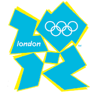
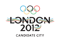 The first entry looks like something from the late 70s. The river running through the letters gets muddled when it drops down to the second line...they took that idea just a few steps too far. It's also too complex for a logo, and wouldn't work well if shrunk down to size (rule 1). The final entry, however, completely loses the Olympic message. it's cool and chic, but what does it say about the Olympics? It could possibly work for a winter games...the blue relating to the cold weather...but this looks like some tribute to Andy Warhol. It's possible the designers were trying to predict style choices in 2012, but if we're really going back to that early 90s neon look, I'd rather wear leggings and foot warmers.
Because it's mean to rant about one city while other did far worse, here are the other candidate city logos along with some critique from the Tribune's panel of designers:
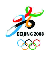 Bergen of the Tribune says that Beijing suffered from too much revision. I think I agree with her, the first draft was interesting and had a great sense of motion and personality to it, while the second draft seems too rigid.
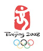
Began interviewed several graphic designers about each logo, and the consensus on this one was:
It's kind of clunky looking...And the Asian-style lettering may veer a little too close to a Western stereotype of how Chinese lettering should look.I thought it was funny how this second draft almost caters to that Chinatown stereotype most Americans picture. The running man is still an interesting shape to me, but it looks to primitive, almost as if it were a cave drawing showing a man running--whereas the first draft you could actually feel the motion.
 This is a nice logo, but I think it's still a little too simple for the Olympics. I feel this would work great on a T-shirt for a 5K or marathon...but the Olympics? And for some random reason, I think it's too pastel.
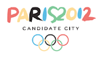 Definitely my favorite. Paris is the city of love, and I think it's genus what they did with the 'S' and '2'. It looks fresh and inviting, and incorporates the Olympic colors without using something so literal (like London's first draft) However, the critics said this typography was weak...but I'm sticking to 'fresh' because you have to relate to the average Joe in some way...
Here's one that looks really cool, but looses some of the Olympic-ness in it. It definitely has that cold, Russian feel to it...but I'm more inclined to see a church steeple instead of the Olympic torch, a point the panel agreed on Definitely broke rule 2.
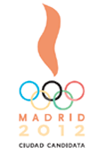
I've saved the worst for last. They really feel short on this one. It looks too bland, and has almost no local identity in the image. It's too simple, which makes it too cliche.

No comments:
Post a Comment