2.29.2008

Projecy Runway: The Secret Challenge

So the reunion was this past Wednesday and not-so-surprise Chris was kicked off. But who cares, we all knew that already. What I really want to talk about is the unfairness of this season on the final 3 contestants (and Chris and SweetPea too). They each completed 10 looks during the season then had 6 months to create a collection....all of this we know....but wait!

At the beginning of the season each designer was asked to create 3 looks to 'preview' the show. AND each designer was asked to create 3 looks for the 'Sew Not Over' competition going on right now.....so really, in addition to the 12 looks in each collection, the designers had to design SIX, that's right SIX extra designs for these promotional events!

While they aren't mentioned on the show, I think it's still fair to judge how these 6 held up against each other.

RAMI
With the top 3, I think it's obvious the boy fell back on his traditional draping techniques. And why not? They have no bearing on if he wins or not, and he can apparently create them at a drop of a hat. While Tim seemed upset that Rami was branching away from draping in his final collection, these pieces show that they are still very much apart of what Rami designs.

As for the bottom 3, I am just loving purple right now. I was really impressed with all three of these because they seem much more complex than the first lot, and considering he was sewing away on his collection at the same time, I will have to say I give his looks an A minus....

JILLIAN
Jillian, like Rami, seemed to use her previous designs as a jumping off point for those first three looks. The jacket is straight out of the avant guard episode, the riding outfit's jacket looks very similar to her last challenge's black jacket in its form, although it's hard to tell from the photo size. Finally, that middle look seems very similar to her mini-dress appearing in her final collection.

Jillian, it seems, did not try as hard as Rami on the bottom looks. I really like the black dress, but there is no cohesion between these looks. I think she was too concerned with her collection to really give these that much effort. However, I still think each look has a very 'Jillian' style to it. While they don't really compete with the other 3-piece collections, it still translates who Jillian is as a designer very well. I give it a B minus.

CHRISTIAN
I remember loving Christian's long scarf at the beginning of the season, but at the same time not really thinking it showed much effort. One thing you can say about this boy is he knows how to put on a show. Big frilly neck accessories are his way of distracting the audience from ordinary pieces, but if the whole point of fashion is the 'look' you represent, that's not a really fair criticism on my part. The other two are fuggly.

As for his final three looks, at least we solved the baffling question of where all the color went in Christan's Bryant Park collection. WHAT THE HELL IS WITH THOSE TIGHTS! That dress is acceptable, if trendy, but those TIGHTS. Made me gag. And I'm sorry, light blue pants with designs focusing attention on your CROTCH are not the type of things women would want to wear. I never thought Christian designed for real women, he's much more about the 'art' behind his clothes than the people wearing them. Finally, it's hard to judge that second outfit, I like the color, but the photo makes it hard to tell if he wants her to look like Working Girl's Melanie Griffin, or if her shoulders are just hunched over in protest. I give it a C.

So. Jillian, while once my favorite, has fallen a little in my eyes as I have embraced the draping that is Rami. I respect him for sticking to what he does best, because he's great at it. Here's hoping he wins. Depends on how much the New Yorkers notice the lack of color in Christian's collection, if you ask me. Should be a fun night.

2.28.2008

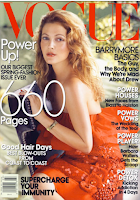
Holy Photoshop Batman!


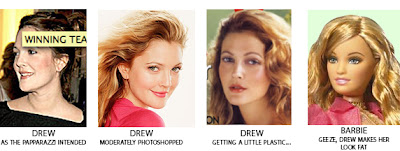
Seriously, this is getting out of hand. Not since Faith Hill has a celebrity been airbrushed almost entirely out of existence! I'm just guessing here, but I would say her eye color is the only real thing about that face. How does Drew Barrymore okay this? She is practically a Barbie doll, in fact here's the proof of her slide into Plastictown.

And the sad thing is, she looks GORGEOUS in that first photo! But you know what, the more and more I look at this, the more I feel like it's not so much a Drew problem as it is an Anna problem. I feel that over the past year or two, Vogue is trying to alter the celebrities on purpose--molding their faces to create a more generic, Vogue-ish look. Because while it doesn't look like Drew, it certainly looks like Vogue.


Jezabel has the cover lies.

2.21.2008

Vanity Fair's Hollywood Covers

Vanity Fair has a slideshow of all the Hollywood issue covers starting back in 1995. I couldn't resist posting the images because my interest in magazines in general can be traced to these Hollywood covers each year.

I think celebrity covers are a big reason to a magazine's success. Now a cynic, I usually skip over the Hollywood profiles because I see them now as purely a tool to generate buzz about the actor's upcoming project. But ten years ago, I would devour those stories each month and held a subscription to Vanity Fair through high school because I thought this magazine, and it's photography was the epitome of glamor and style.

The first two are so 1990s....


The first one I bought, in 1997...I think they do best when going for the formal gowns

Natalie Portman was so young here...love me some tuxes

Back to the casual....it's so Seattle DotCom, don't you think?

The title of this cover is "Splendor in the Grass" a book whose theme is about the inability of a young man and woman to live up to their youthful promise in both love and life.....that in no way connects back to these actors...all of which are in such high demand today....
...and NO marrying Tom Cruise does not count as a career boost.

This was the first one I believe that used Photoshop to combine the group. I distinctly remember this cover honoring these great old actresses by placing them in between young, hot ones. How did Catherine Deneuve get on the cover over Sophia Loren? COME ON!

I would love to see the circ data on these covers. I guarantee the casual does NOT sell.

Funny how in an industry dominated by men, men rarely turn up on the cover.
Five people on the cover flap....eek!

This will always be the cover that comes to mind when I think "Hollywood Issue"

Cate Blanchette looks bizarre here. Why does Uma always get on the cover? What really has she done since Pulp Fiction?

ICK! TOM FORD YOU MISOGYNISTIC AHOLE!
What a jerk...I fell in love with Rachel McAdams when she walked out of this set after they asked her to take off her clothes.

Two inside pages of penguins? I understand the magazine was still apologizing for putting an enlarge profile shot of a breast in last year's photo gallery, but really, couldn't the magazine do better than Ben Stiller and Jack Black? There must have been a boycott...

AND FINALLY this year:

I don't mind the colors. It's going back to styling the dresses in a glamorous way, but I do agree with Jezabel when they said it was a little too Easter Eggy for them. And I don't really understand Jessica Biel on the cover flap.

One last interesting note on my favorite cover each year: I found this handy list of how many times actresses appear on the cover of the Hollywood issue. [Originally published as a comment on Hot Blog's list]

An astrick means they appeared on the front fold. For the One Cover gals, I'm just calling out front fold peeps. Who cares about the has-beens, right?

Three Covers:
Scarlett Johansson (2004, 2005, *2006)
Gwyneth Paltrow (1995, *2001, *2004)
Cate Blanchett (1998, 2001, *2005)
Kate Winslet (*1997, 2001, *2005)

Two Covers.
Claire Danes (*1997, 2005)
Rosario Dawson (2002, 2005)
Uma Thurman (*1995, *2005)
Jennifer Connelly (*2002, *2004)
Kirsten Dunst (*2002, 2004)
Julianne Moore (1995, *2004)
Naomi Watts (2002, 2004)
Selma Blair (2000, 2002)
Penélope Cruz (*2000, 2001)
Nicole Kidman (*1995, *2001)

One Cover:
Amy Adams (*2008)
Jessica Biel (*2008)
Emily Blunt (*2008)
Anne Hathaway (*2008)
Keira Knightley (*2006)
Kate Beckinsale (*2002)
Catherine Deneuve (*2001)
Meryl Streep (*2001)
Mena Suvari (*2000)
Thandie Newton (*1999)
Monica Potter (*1999)
Reese Witherspoon (*1999)
Natalie Portman (*1998)
Cameron Diaz (*1997)
Jennifer Jason Leigh (*1995)

2.15.2008

Project Runway: Rami's Collection

Oh Rami. I love you. The way you stubbornly stuck to your draping is reminiscent of Uli and her prints, Laura and her plunging necklines, or Austin Scarlet and his gowns. I would venture to say that the biggest challenge of Project Runway is to stick with your design style EVEN when the judges are tired of it. So what if it's not in style right now? This is what you're best at and you have to work it as long as you got it if you want to make it in the boutique fashion world. I was very happy when I saw your collection, you managed to create a cohesive look that most definitely said RAMI.

-click to enlarge-
(1)
(2)
(3)

I LOVE that first dress. Enlarged, you can see the leaf pattern around the stomach and neckline--I love that detail. It looks like a really nice pattern, although I do wish I could see it from another angle. No. 2 is a very nice office look of the first color, but the transition to No. 3 is my biggest problem with your collection. I wish I saw that blue again, because I LOVE blues, but you probably did the right thing putting those first. And it's not necessarily a problem with your color pallets--because I think the blue, red (4-7) and green (8-9) all complement each other nicely.

Other Designers: take note. This is how you incorporate MANY colors into one collection. Nice, isn't it?

(4)
(5)
(6)
(7)

Each of your looks has a different executed style. Unlike Christian, who seems to only be able to do skinny jeans and poofy jackets, you have taken your beloved draping and showed the versatility of the style that you couldn't necessarily do during the challenges. The draping of No.4's shirt is really nice, while No. 5 is reminiscent of the 80's shoulder pads (ugg...but that fuggly Working Girl look is in style now, so i can't really fault you). No. 6's skirt has some complicated pleats, while your more classic draping is seen in No. 7.

Again, I think it shows your skill that you can differentiate between so many looks, and yet still maintain a strong cohesive collection. Moving on, I am not so much a fan of 8 and 9, I don't like that color, and think those are less innovative, more stereotypical 'Rami' looks:

(8)
(9)
But I was happy how No. 9 transitioned into the evening wear:

(10)
(11)
(12)

Cheers to you for showing some range. You managed to present office AND evening wear in one collection and I think you did a good job. The dresses are all different, and No. 11 especially is very nice and more importantly, very not-draped. Way to show you can do something different and still make it rock.

But will it matter? As of now, we don't know if you've even made the show, which is a shame, because I think this collection was the best out of the five. I think your looks can definitely beat out Chris's velvet, but I'm not sure you have the -JAZZ HANDS- 'Christian Fierceness.' Know that I'll be pulling for you....

2.14.2008

Project Runway: Christian's collection

Christian Christan Christian. I don't care how 'fierce' you are or how talented a designer you are, there is NOTHING that could convince me to wear anything you make. Now I've been creating my recaps in the order that I rated the collections, PRIOR to last night's episode. I still think Rami's is a better collection, and I would still wear both Sweet Pea's and Jillian's clothes before yours, but based on how the judges responded to your puffy sleeves last night, I'm going to go ahead and say it now: You're probably going to win. Congratulations! It was not only the easiest season yet, but also the most boring...anyway on to your collection.

-click on images to enlarge-

So what did I think? I hated it. But even hating the designs, I will still give you the fact that it's a solid collection. Each piece fit into the story and while I hated the lack of color, at least it had its purpose. I would like to mention here that a lot of these collections seem to have historical inspirations to them. Here it was more like a Puritan funeral meets a Victorian race day:

(1)
(2)
(3)
(4)
(5)
(6)

WOW. Wasn't that depressing? I felt like I just got back from a funeral. I understand people in New York City like to wear a lot of black, but to actually present an entire collection in black kind of screams "I'm not from here but DESPERATELY want to feel like I get the the FABULOUS Manhattan culture." Of the first 6, I liked the shirts of Nos. 2, 3 and 5, five especially. 6 has a nice jacket, but by the time you get to it I'm too sober from the color choice to appreciate it. At this point all I'm seeing is black black black.

I feel sorry for Rami for being 'passionate' about such an obvious thing like draping. Because Christian has the same problem with puffy sleeved-jackets. Really Nos. 2 and 3 are the SAME thing. It's much too severe.Why couldn't you mix up all your blacks into the second half of the collection? Balance out the sobering jackets with Robin Hood and his Merry Men (9). Speaking of which.....

(7)
(8)
(9)
(10)
(11)
(12)

Now I have to give you No. 8. That shirt ROCKS. Never let them say I don't give credit where credit's due even when I hate you and everything you stand for.... I love the sheer shoulders, and that color is really nice for the office. I liked your neutral color pallet, I think it worked really well against the blacks, I just wish there was something else in there to add a little excitement. Especially when InStyle says BRIGHTS are in season....

All in all, the second six looks are just too costumey. I understand that last one (12) is your shock piece, but really, would someone wear this? It's so full and heavy, I itch just looking at it.
10 and 11 I think are just plain fuggly....and don't think I didn't notice your fur lined shoes (10)...

SO why do I think you will win? When the judges rewarded you with your third win, it became clear they are obsessed with you. Anything you do, no matter how repeatitive, is at least fashionably repetitive. I think they will go ape shit over your collection and you'll be dubbed Season 4 winner....god help Jay McCarroll because I do believe he's just been dethroned.

2.13.2008

Project Runway: Jillian's collection

So everyone knows Jillian has been my favorite designer this entire season. She actually seems like a serious designer looking for something more than screen time, and I'm willing to overlook her not being oh-so-dramatic during the episodes. Unlike others, I watch the show for the creative challenges, not the producer-created drama. BUT how would my golden child hold up at the fashion show? As much as I dislike Christian, I unfortunately have to place Jillian's collection under his because it just didn't have as much focus. Jillian gets my No. 3 spot: great clothes, confusing collection.

(1)
(2)
(3)

I liked 1. and 2. to start off with. The gray is a favorite color of mine and I thought the scarf was a nice casual touch on a formal color. No. 3 is a little eccentric--a little riding habit-esque--but I was willing to go with it. Every collections allowed to have its whims. And then I got to Miss Wonder Woman 2008:

(4)
WHAT THE HELL IS THIS? It's a Cleopatra color that looks too short to be a formal dress and too old to be a cocktail dress. Who would wear this? I was completely befuddled. Even more so when I saw the follow outfit (5) match the previous three. It almost gave me whiplash--classic...classic...quirkyclassic...CRAZY....classic.

(5)
(6)
While the skirt matches the rest of the collection in 6, The black and white was a drastic, and not necessarily good change. It's a boring look and I don't like the cream shoulders against the white/black stripes. Was the extra challenge that everyone had to create a black and white outfit for their collection? This REALLY didn't fit.

(7)
(8)
(9)(10)

And then we go back to the classic, Jillian looks in Nos 7-10. All of these at least match her story--but because of the outliers in between them, I had completely lost the collection's story thread at this point. Honestly, if you took 1-3, 7-10 by themselves, it would be a fantastic, be it somewhat drab color. As I said, I love gray, but you really have to throw another color in there to mix it up--something bright--not something mixed with black (4) or something dark itself (like No. 11).
(11)
(12)

By the last look (12) I was crestfallen. It's a fine formal gown, but overall this collection put me to sleep. I love the Jaslene dress (10) but all this black just did not deliver. Christian had the same problem, in my opinion, with too much black, but at least his collection has such a definitive story and style attached to it, the color, or lack there of, works for him.

All in all, Jillian presented a polished collection, but it doesn't have the oomph that will win her the competition. BUT I'd still buy her clothes.