7.30.2007

As if pot-luck fliers were the only things I had to do...


So as I said before, the last month was crazy busy. I think the problem was over the past six months (my DC internship and vacation at home) I got in a very laid back groove. There were things that needed done, but I was never stretched on deadline. Things changed in July. People left me alone in the office, we moved up a floor with EVERYTHING needing to be packed up, it was DEADLINE (which no one in our department understands), so it was also full of random assignments for me to do.

Anyway, at some point during this crazy time I was also freelancing for my mother to create fliers for the neighborhood pool. This all started during June, when I had nothing to do and was completely BORED so I told her I would design a sign for her tennis night, and soon there after the water aerobics class. I wouldn't brag about either one, I was pretty much using it as an opportunity to play with the Illustrator brushes that I can never justify using in any other situation. But my mom was of course blown away, which would lead to problems later on.

Enter the pot luck dinners. She wanted something for the Fourth of July, but I was at first completely uninspired. My first attempt was horrible, hardly worth publishing except to show you the transformation. My goal here was to 'tone it down' because honestly, what sort of artistic signs does someone expect at a neighborhood pool? If something looked professional, would this turn people away? I tried to dumb down the design, but my mom wasn't having any of it. She suggested something with (I quote) 'clip art flags' which pretty much sent me in a hissy about artistic standards. I responded with my 'modern flier' that I honestly didn't expect her to like at all:
My message here was something along the lines of 'You want patriotism? I'll give it to you in a modern abstract style you will hate, but at the same time feel uncultured if you want something else' . Except then she loved it. Or at least knew when to not argue any more with me about something as silly as a flier for a pot-luck dinner.

Anyway, I thought all of this was behind me, until she comes at me with another challenge: a SECOND pot-luck dinner! How do I create something a second time when this time I don't even have patriotic colors to fall back on? My answer was finding the right color pallet. I have been attached at the hip to this new web site that posts interesting color pallets (I promise another post more on this) and after finding colors I liked, I decided to play around with typography until something appeared. Enter my final flier for the Summer 2007 season:

I'm actually proud of this one, it looks wonderful and lining up all the letters in 'Pot Luck Dinner' was more complicated than it looks--there was a lot of kerning and fudging straight lines in there--I really enjoy looking at it. The subtle water at the bottom connects the flier to the event (a pool party) and the thin stars creates a wonderful retro feel. I think watching Mad Men has been rubbing off on me.

So what did I learn from this? Apparently if you do something enough times, eventually something exciting will pop out from it. You can learn new tricks from even the smallest assignment, all you have to do is go into it determined to use your new skills. I wanted to practice my typography and color, and this last flier helped me do that.

Why do we use that -30- sign?

I promise more posts to come soon, I had a crazy week at work between deadlines and moving offices (yikes!) but I think this is the funniest NYT correction EVER:

An article on Thursday about the arraignment of three men in the shooting of two New York police officers, one of whom died, misstated the schedule set by a judge for a trial in the case. The trial is expected to begin by February, not by “Feb. 30.” The error occurred when an editor saw the symbol “— 30 —” typed at the bottom of the reporter’s article and combined it with the last word, “February.” It is actually a notation that journalists have used through the years to denote the end of an article. Although many no longer use it or even know what it means, some journalists continue to debate its origin. A popular theory is that it was a sign-off code developed by telegraph operators. Another tale is that reporters began signing their articles with “30” to demand a living wage of $30 per week. Most dictionaries still include the symbol in the definition of thirty, noting that it means “conclusion” or “end of a news story.”


My first writing professor told me to use it, and actually took points off if it wasn't on the page. He was major old-school, and I should have known my habit was a little behind the times when no one in my masters program seemed to know what I was writing there. But seriously, you'd think of all the papers to KNOW about the -30- sign off, the NEW YORK TIMES would.

7.11.2007

Another one bites the dust... JANE folds

In the magazine business you have to expect failure, but this one I'm sad about. I believe the number is like 1 in 10 magazines launched will last more than a year, if it even makes it to the launch. Pulling from my old Publishing notes, the fabulous Mr. Magazine, Samir Husni, made a good point that this number is so drastic because no one really knows what they're doing. People with passionate pastimes (ah, alliteration...once it starts you really can't stop) put up the capital and realize after the fact having at least some background in journalism (say, you've read newsstand titles before and know readers will buy '10 Sexy moves' and ignore 'Top Needlepoint designs for Spring') can make a huge difference.

Even successful magazines eventually become stale, and when Premiere closed in April, I moved on. I'll admit, it hurt to see my absolute favorite title go online right after I bought a two year subscription, but I finally decided to fall back on the cliche: all good things must come to an end. You just need to take comfort in the fact you were alive and able to experience greatness at the time of its inception.

I mean, look at some of the magazines that are still alive:

COLORS makes strong statements about the state of the world, but its reputation was begun with the 13 issues Tibor Kalman produced in the beginning. It hasn't really been the same since. (One note: I found this great book that printed a compilation of those 13 issues, fantastic read)

Rolling Stone hasn't made a statement since they moved to a color press. They are trying to pretend that their uppity leftist beliefs about the government combined with celebrity profiles and paid-for CD reviews is in no way hypocritical.

Esquire is up there with the New Yorker as one of those 'great' magazines no one seems to read. Over the past year their art director, David Curcurito, has really been blowing me away with his anti-sell-line sell lines, but the real question will be if this blatant disregard for cover rules pays off on the newsstand, because you better believe if it doesn't work, all that creativity will be gone in seconds.

Closing down magazines is always sad, and most of the time hard to explain. When ElleGirl closed last year, it was pretty much the same story as JANE: the magazines with positive future numbers couldn't fight the slumping advertising sales and the large media conglomerate wanted to jump ship.
After the news, [Jane Editor Brandon] Holley spent the afternoon making calls on behalf of her staff, and was said to be stunned by the closure, believing that the magazine was in positive turnaround and that six more months would have made the difference. Source

But why are these closing hurting me the most? True, Premiere and ElleGirl are online now, but that creativity that comes from a really crazy spread design isn't there with it. One of my first blog posts (on the old blog) had a brief mention of JANE's design. While it wasn't that innovative, it was surprising, especially for a teen magazine. Sure, it was silly at times, but last year they started the short-lived trend of tight face shots on the cover as opposed to the 2/3rds rule implemented everywhere else.

Everyone says magazines are moving online, and I'm sure one day the technology will be there to have great design on the Web, complete with virtual pages to turn and everything, but right now it's horrible. Sure I'm biased, I am a designer and online magazines hurt my chances at potential jobs, but there has to be other people out there besides me who love flipping through the pages of a magazine while lounging on the couch after work, or on a weekend. Sometime I'll buy magazines I have zero interest in reading just because I like the way they laid a spread out. Magazine design is a complex balance between the story and photos, but also includes color, font and grid choices. A magazine online is almost as bad design-wise as reading the Wall Street Journal: lots of text, no color variations and small, boxed photos.

And to add insult to injury, Ibought the last issue of JANE and absolutely love it. Would totally get a subscription, if it wasn't FOLDING. I'm pretty sure I'm just jinxed. God help the company I work for now.

7.06.2007

Putting the Teapots back in Modernism

"Design combines good taste, technical knowledge, and common sense," wrote Raymond Loewy

So I first heard about this Modernism exhibit on 60 Minutes, I was intrigued how so many fantastic artists and designers got caught up in designing for the mundane. This State slideshow gives you a nice introduction into some of the things Modernists were doing back in the 20s and 30s in Europe, as well as making a good point on the distinction between European and American modernists.

While I appreciate the function and simplicity of many Modernist objects--the chairs, the teapots--it's a little amusing to see this same group get caught up in designing the blocky corporate neighborhoods that would later become low-income housing projects around the world. Sure, they look clean and streamlines--but it also invokes the image of a prison.

I suppose my conclusions about Modernism are mixed. I definitely see similarities between today's 'Real Simple' design aesthetics and modernism. Cultural navigators like Ikea and Martha Stewart present almost a rebirth of this old-fashioned ideal, but possibly with a more colorful, less metallic image. Instead of trying to create a hegemonic design standards for us to live, eat and breathe by, designers today are trying to break from that cookie-cutter role the Modernists got us into fifty years ago.

Modernism works on a small scale. Simple lines are refreshing and peaceful when applied to furniture or objects--reducing the clutter that so often builds up in our lives--but by trying to apply the same standards to a mass audience will only end with more Suburbia cookie-cutter nightmares that have become standard in our country today.

Lowey said design is a combination of good taste, technical knowledge and common sense. The Modernists definitely had an ideal utopia planned out in their heads, but they failed to see that if you try to implement a standardized style for everyone to live by, you lose your individualism in transfer.

7.02.2007

If journalists protest the news, are they still fair and balanced?

No, I did not watch the Paris Hilton interview. Sure, I may have scanned TMZ throughout the week to find out what new major corporation was trying to piggyback off her celebutard status, but I felt by skipping the first-hand news I was delivering a message. Because isn't that what journalists are suppose to do? And of course I don't mean delivering facts to a waiting audience, but of course lording over them with my own moral and ethical dictates about what everyone should be watching.

I don't really want to analyze why I hate the Paris Hilton story because honestly, I think everyone gets it. Everyone knows this isn't really important. Everyone gets the irony. Everyone is watching the story anyway--you better believe that even as I was announcing to my friends how I wouldn't be caught dead watching the interview, I knew I would eventually see the entire thing cut up over YouTube and Best Week Ever--and that brings me to what I will rant about: journalists' protest of the story.

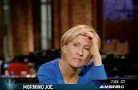
If you haven't seen the Mika Brzezinski meltdown on MSNBC, you're missing a riot. In a three-minute span, she tries to ignore, shred and burn the Paris lead-in, only to have the producers feed in video of Paris' release over her distress. Sure, she was trying to make a point, and yes, it's funny. But really, what right does she have to suddenly decide not to talk about the story? Cable news programing has been going downhill for so long, I'm pretty sure everyone involved might be a few inches away from journalistic-hell. If you choose to cover celebrities, this is what you have to deal with--it's your way of life.

I have more respect for US Weekly's editor, Janice Min, who announced the magazine will not be covering Paris at all. While Mika and Anderson Cooper try to push a journalistic-standards boulder up the cable-new-show mountain, US Weekly's absence of Paris coverage packs a more powerful punch. Unlike MSNBC, CNN, et. al, Min's publication is in the business of celebrity news. People buy her magazine specifically to find out what food Paris ordered in jail or what 'salvation' she received behind bars.

To ban your lead story takes some guts, but don't run out the door to subscribe to the magazine just yet. Min explains her actions at Slate, saying that a big reason for the ban had to do with US Weekly not landing the post-jail interview.

In some ways, the decision to ban Paris was a pragmatic one: Her release occurred too late during our Monday night close for us to offer much reporting on it, and we hadn't landed a post-prison interview. (When Hilton's attorney asked Us to offer a bid to interview the heiress, our request to make it a charitable donation to an organization such as MADD was rejected.) But I also sensed an ever-mounting public frustration—"Please let me off this ride!"—with the Paris story.
I swear, the media economics theory I used to defend my master's project is jumping up and down right now.

So now Mika is a heroine but honestly how much of an effect do you think her actions had on the whole media machine? Probably as little as hundreds of actual journalists protesting an impending buyout by Rupert Murdoch. At least Mika showed up to work.