5.27.2008

Yet another reason to keep your legs shut....

Of course the moment I end my subscription with PRINT they come out with something awesome.

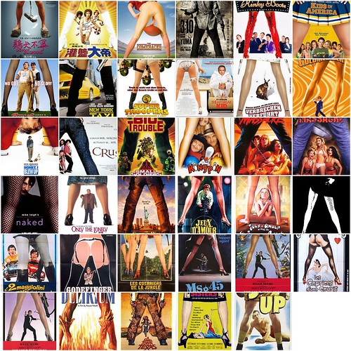
Steven Heller (Oh Holy One) has figured out that the most copied layout that spans mediums, including magazine covers, pulp fiction, advertisements and movie posters, is the Split A-Leg Frame:


View all sets on Print's flickr page They have slideshows and individual images to scan.

[Found on Gawker]

5.19.2008

Something to make your Monday more depressing...

The ad page gains/losses for the first half of the year are in and it ain't pretty:

The feared advertising-page collapse strikes hard in June. This follows a weak economic 2007 and an even weaker early-2008 with a cumulative monthly differential not seen since the "upscale recession" in 1991 (after the first Bush Administration's brief "luxury tax") and in the fourth-quarter-2001/first-half-2002 aftermath to the September 11, 2001, attacks.[MinOnline]

June pages are down 11.13%

A bad omen for the women's-fashion magazines as the critical September "Fall Fashion previews" near, and for nearly all in the fourth quarter with its emphasis on holiday-season advertising. Even worse, the timeline ... suggests a "delayed effect," with cumulative ad pages up each quarter last year even after the economy went south. [MinOnline]

Looks like a fun year is in store for magazine folks....although some titles are doing well. The top five increases in ad pages:

1. Woman's Health (32% gain)
2. Successful Farming (18%)
3. SPIN (17%)
4. Everyday with Rachael Ray (15%)
5. House Beautiful (13%)

5.15.2008

Worst Logo Ever


Let's see what we have going on here:

  • Embossed All Caps... CHECK
  • Elaborate Script...CHECK
  • Tracked Out Sans Serif...CHECK
  • Drop Shadow at a very ODD angle....CHECK
Too many jokes to process...must. stop.

5.14.2008

Cover Wars!

I love a good controversy, especially over creativity. The New Republic and Time have apparently been going at it over who ripped off who in their recent covers.

A few weeks ago TNR started wining when TIME released a split cover shot, similar to their previous candidate-merge cover:

Verdict: I'm siding with TNR on this one. Their cover is better executed, and while TIME tried to hide its steal behind sepia tone, the matching cover lines doesn't help them much.

Then there was this week's TNR cover, of Obama as a paint-by-numbers image. TIME immediately pointed out they did a paint by numbers cover first with Howard Dean back in 2004. Without getting into the conspiracy theories that TNR copied TIME on purpose to get back at them for the Hilbama cover (I have this nice image in my head of a TNR budget meeting with incensed art directors shouting out 'what if we did it to THEM!') look at the evidence:


That's right. TNR did their paint-by-numbers cover before the Dean cover broke of Laura Bush.

Verdict: PR mischief. Look at the dates. First cover is in 2001, then in 2004, then in 2008. There's a gap of time between the first two and the 'paint-by-numbers' idea actually fit Howard Dean in that election...so I'm giving Time a break. The TIME cover is available online and farely recognizable, so while I won't say TNR stole their idea, I'm not sure how it fits with the Obama campaign. Maybe I will get into conspiracy theories....


UPDATE:
Apparently they are all copy-cats: Esquire did it first. In 1967. UnBeige had the scoop
5.08.2008

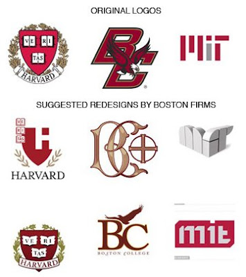
Hard to update something that's suppose to be 'Iconic'

Saw this at UnBeige:

The Logo Strikes Again! Boston magazine asked several design firms to recreate different college logos and what was produced was a mixture of Crazy (just because it's MIT doesn't mean you have to design it in AutoCad) Hip (the blocked-out H in Harvard is innovative, but so not right....as if the university decided to completely sidestep the whole college application process of rejection and go straight to punching you in the face with how much better they are than you...you can't even understand their LOGO) and actually Decent (the bottom Boston College logo is simple, less dated and more intellectual...i like it!)


Go to Boston's website to see the designer's defense for their recreations.

Billion-Dollar Baby Business

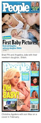
New York Times had an interesting article eariler this week on the outrageous price of baby photos of celebrities:


Million-dollar payouts were unheard of a few years ago, but that changed when the United States version of OK! was introduced [in 2005]. Now there is about one a month. In March, People set a record, paying what industry executives say was $5 million or more for the first public pictures of Jennifer Lopez, Marc Anthony and their newborn twins.

An exclusive set of pictures, with one on the cover, can increase newsstand sales, but rarely by enough to sustain a payout of $1 million or more. Even at the full cover price, analysts say, each extra copy that a magazine sells above its norm generates less than $2 in income.

More commonly, an important exclusive sells an extra 300,000 to 500,000 copies — providing less than $1 million in added earnings. But that is just the American part of the ledger. Exclusive pictures have a greater effect on Web traffic; People.com briefly doubled its usual number of online readers when it featured Ms. Lopez’s twins, with about four million viewers in a single day. That kind of traffic can translate into more advertiser interest, but the magazine does not disclose such data.

I understand Tom Cruise and Brad Pitt's babies made huge news---but with each new wedding or kid it seems a little more extreme. I thought it was histerical that Christina Aguleria's baby cover sold poorly on the newsstand and it was treated by the blogging community as an insult to Aguleria's popularity...instead of perhaps, a lack of juicy gossip behind her pregnancy in the first place?

In the end, it's all a PR tool:

“The consumer’s expectation is if the photos are going to be available, I’m going to see them in People,” said Paul Caine, the publisher of People magazine, a Time Warner property. “If we don’t get them, we miss that brand promise, we lose the halo that goes with that.”


5.03.2008

Inspirational Smells


My entire town smells of honeysuckles. There is a long bush growing up my front door and as soon as I leave each morning I get a lovely sickeningly sweet aroma in my nose. It would drive me insane after about a week, but in the first days it just makes me happy. It's spring. Life is good.

5.02.2008

Ellie Awards

Wired won for best design. I interviewed Scott Dadich two years ago when he was the creative director at Texas Monthly and I followed his work when he moved to Wired in the Fall of 2006. I realize it's not just him calling all the shots on the covers and redesigns--but its great to see a magazine that embraces innovation and crazy covers.

Vanity Fair won for Photo Portfolio for the 2007 Hollywood Portraits. The story was shot in 'film noir' style and actually carried a plot through the entire album of photographs--I believe Bruce Willis was the 'detective' main character.

And of course National Geographic won big with the most awards all night--including one for Photography.