1.29.2008

Other Blogs: Cover Lies


Pretty funny tag on MagHag...they go through the cover lines and compare them to the actual stories, calling out gross misinterpretations. Hysterical and quick.

So far they've done Marie Claire, Glamour, Elle and Cosmopolitan. Cosmo is def. the most fun.

While I'm on the subject of Weddings...

Also from InStyle Weddings. I detest the wedding dress. As my sister just got married, I've had a lot of time to consider my own options whenever it comes to that.

First, I don't want any 'princess' type gown. The goal is to be able to go to the bathroom ALONE and hence, I automatically cut out any dress that requires a petticoat.


Second, I want something that is slender. I like the above dress because I have a Jane Austin kick, but would consider taking this and hemming it to my mid-calf? Something very springtime and outdoorsy.

The above dress isn't really my style, but I love those flowers. My friends will know--I bought an obscenely expensive dress from Anthropologie even though it really doesn't look very becoming on me because it had flowers that that sewn along the bottom.

That is all.

Wedding Invitation Inspriations


So my friend Mike Davin sent me this link today about wedding etiquette. The first chapter is all about wedding invitations and details in a rather hysterical way what all that paper actually means to the layman guest.

Official invitation
What It Is: One sheet of paper will contain a lot of writing on it, and for that reason you will be tempted to skip over it. Don’t; this is the actual invitation that contains essential pieces of information, including who is getting married, where and when the ceremony and reception will take place, and whether the couple would consider themselves “honored,” “blessed,” or “honorably blessed” by your presence.

Enjoy, and while we're on the subject of weddings, here are some pages I pulled from InStyle Weddings that asked designers to create really innovative invitations. For future reference, really...


1.27.2008

Inspirations: Movies

Thought I would record some of my inspiration in film:

The opening credits of Velvet Goldmine
I really like the color combinations during the credits--lots of fun color choices here.

Returning the Painting in Thomas Crown Affair
The soundtrack during the scene is great, even if the plot is illogical.

The Credits during Thank You For Smoking
The colors, the graphics, the retro feel....wonderful.


1.23.2008

News Briefs: State of Magazines 2008

Magazine Guru Samir Husni was interviewed on his take of the magazine industry going into 2008, with these comments to say:

"Publishers no longer launch magazines looking for a million readers. The new face of magazines are niche titles that may never exceed 10,000 in circulation," he said.

10,000! That's a tiny number, especially when I work for a publication with 1.75 million readers. Does this mean large titles like mine are destined not to make it, while smaller ones, like city magazines will? City magazines naturally have a small circulation, but they also do well during rich economic times--unlike these...Husni's comments are basically saying magazines can work if you have a very specific mission and readership--and then target a specific, small number of advertisers that are interested in this niche.

Meanwhile, Mark Glaser gets his two cens in:

But the magazine business as a whole remains relatively healthy because of the rise of so many niche publications and the staying power of glossy entertainment news," he said.

Glossy entertainment! As well as these magazines are doing, aren't they today's 'General Interest' pubs in that, everything found in them is older and more selective of the THOUSANDS of gossip sites that have the exact same photos? My bet is in five years, the supermarket pubs are just as dead as Time or Newsweek.

1.18.2008

News Briefs: returning from hiatus...

Wal-Mart plays magazine God...
...its shoppers, apparently, aren't foodies or New Yorker snobs

Real Simple develops a Wedding magazine...
...isn't the idea of a 'simplified wedding' an oxymoron?

Golfweek gets in trouble for a noose...
...how is this 'tabloid' journalism?

You will be fired...
...but not if your only a temporary employee!

Magazine are doing well...
...Just not well enough

Rachel Ray loses staffers...
...Wow, and I thought she was invincible...

MPA chairman stirring up trouble...

...Measuring success by readers, not ad pages...what's next, editorial standards?

Ms. Magazine hates Jewish people...
...Is it just me, or did anyone else think they didn't have any advertisers---therefore hating everyone (just like women)

1.17.2008

Would you photoshop to the point of anorexia?


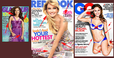
I understand photoshopping stars on magazine covers is something we have to live with. [Check out Faith Hill's transformation here from Jezabel] In the past few months it's been more and more prevalent, in my opinion. But I'm not sure if that's just because I've only started to notice the obvious fake-ness because my own Photoshopping skills have increased, or because they're just using the technology more and more.


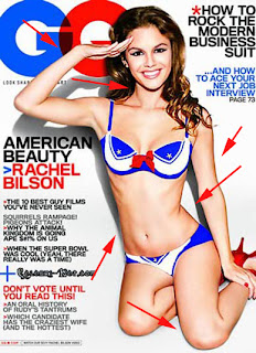
But the recent issue of GQ really troubles me. Strangely bizarre pose aside, the girl still looks sickly. The question is, is she really anorexic, or was she just photoshopped to look that way?

In my analysis above, I pointed with red arrows to body parts I feel could have been photoshopped, the work given away by the clean lines and uber-perfect lighting on their skin. Seriously, if you took Ugly Betty's arms and examined them alone, or Faith Hill's back (it's hard to tell with the cover line over it) or the left side of Rachel Bilson's stomach, all these seem a little too perfect.

I sincerely hope GQ didn't photoshop in that right oblique muscle below her rib cage, because that would be alarming. GQ isn't a women's magazine, so putting Bilson on the cover isn't directly intended to screw with women's self-esteem as much as Glamour or Redbook. Instead, you would think GQ puts Bilson on there because that's what the guys obsess over...so does this mean guys want to sleep with a pile of bones? God help us if this is what turns men on...

1.15.2008

Et tu Martha? A Deziginer Eulogy to Blueprint

So Blueprint was axed in December. It was a sad time for all of us here in my department, mostly because we pretty much worshiped that magazine every month. It seems like only yesterday that my friend Megan showed me a copy of the first issue.

I'm a little upset they only gave the bimonthly a little over a year to produce profits or ad pages or whatever they were needing. I think given another two, Blueprint would have gained a lot of readers. Unfortunately, this publication was the victim of a bad economy and a small company (publishing-wise) and they just couldn't keep it afloat any longer.

In honor of their last issue, I wanted to post my top FIVE favorite things about Blueprint:

1. WHITE SPACE. They took Real Simple's idea and ran with it. Their tiny columns surrounded by empty space made the rest of us look like simpletons with our lack of text.

2. TYPOGRAPHY. They brought back Victorian elaboration in a quirky new way that worked with modern sans serif types. I could stare at that ampersand for ages.

3. INNOVATION. Not ones to just keep things the way they were bought, they came up with creative craft projects that made anyone think they too could decopague their own chest of drawers. It was a ReadyMade, but with sophistication.

4. COLORS. Their pallet wasn't just limited to the basic pastels. Everything in the book was so soothing to look at, and yet they changed with the seasons.


5. AND FINALLY EASE and CONFIDENCE. They actually left the space to show you how to create these fantastic pieces. I am totally making that shadowbox jewelry case. And you'd be surprised how easy the steps are. They weren't ashamed of taking a project to kinkos or using spray paint...and that made it even easier for me to think I could create this stuff.

I'll miss you Blueprint!

Leaving it up to God...and magazine editors


Interesting study in Science Daily:

African-American women's magazines are more likely to encourage fad diets and reliance on faith to lose weight, while mainstream women's magazines focus more on evidence-based diet strategies, according to the study by UI researcher Shelly Campo, published in a recent issue of the journal Health Communication.


Not really sure if I have a comment about that study, I always find discrepancies among magazines so interesting. Another that comes to mind is how during Breast Cancer Awareness Month last fall, almost all the women's magazine suggest that people buy things in support of the disease, as opposed to actually testing themselves or other potentially life-saving tips:

Marshall surveyed 9 magazines from a grocery store rack --Essence, Redbook, Good Housekeeping, Women's Day, Women's World, Ladies Home Journal, Glamour, Vogue and Beyond Breast Cancer -- and found that all of them trumpted breast cancer articles on the covers of their October issues, but only two also covered domestic violence. What's worse, she writes, "of the coverage dedicated to breast cancer, much of it was offensive, superficial, misleading, or flat-out wrong."


Consumerism at its finest.

Also, this seems as good of a time as any to bring up something I look forward to each month: The MagHag Black Model count. The blog has taken it upon itself to point out how few minority models appear in both editorial and advertising pages of women's magazines, and follow it up every month with a tally of all the magazines.

Two interesting points: first, they distinguish between celebrities and other models...always good to know that without the feature article on Rhianna and other celebrities in January's Allure, you'd be left with 2 non-celebrity black models, 1 asian and one 'ambiguous' race girl.

Second, January is apparently the unofficial 'minority' cover month for a lot of magazines. They suggest the low ad pages in the month correspond with the minorities on the cover. Not sure if this is directly related, but interesting nontheless.